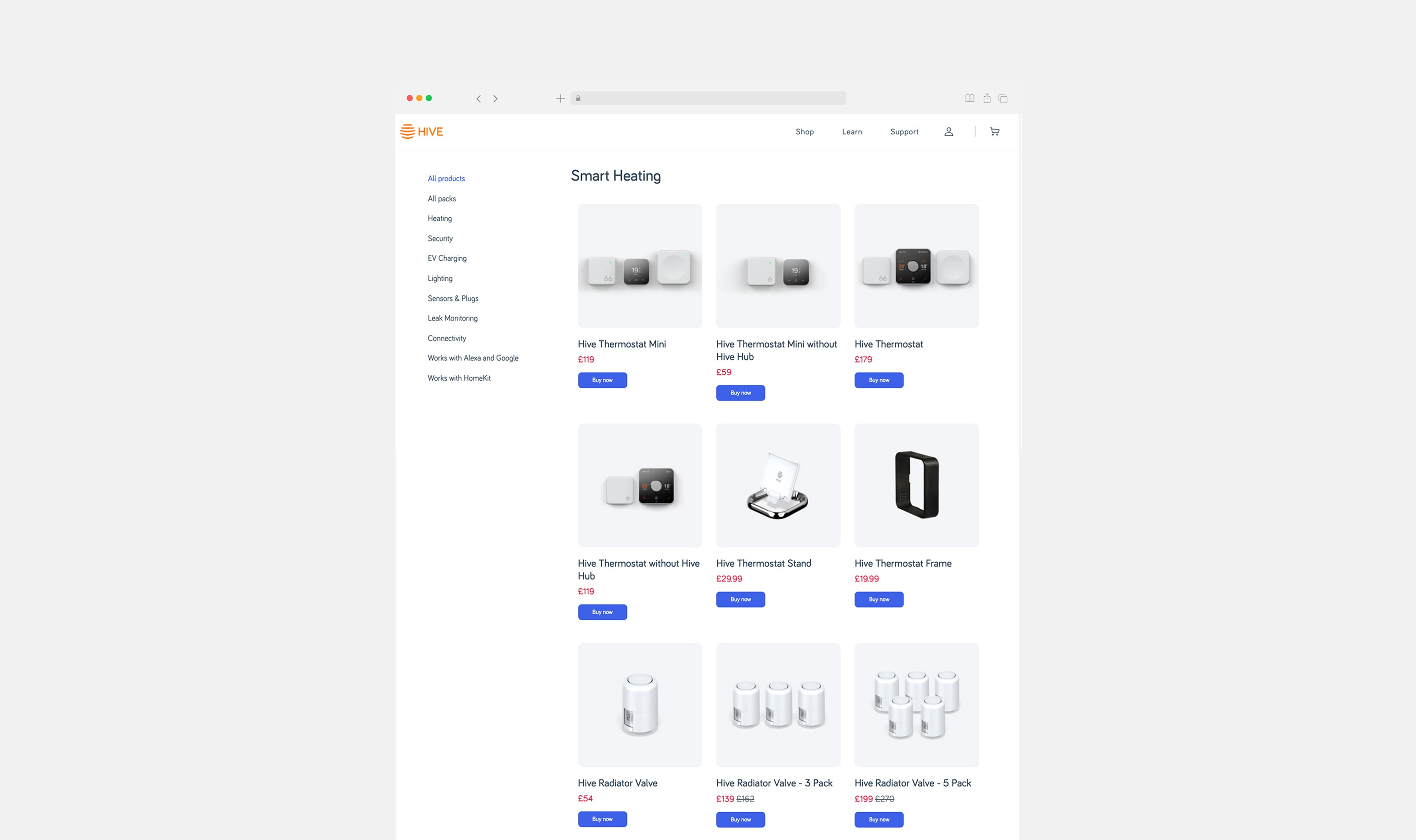
Website + Design System
Hive
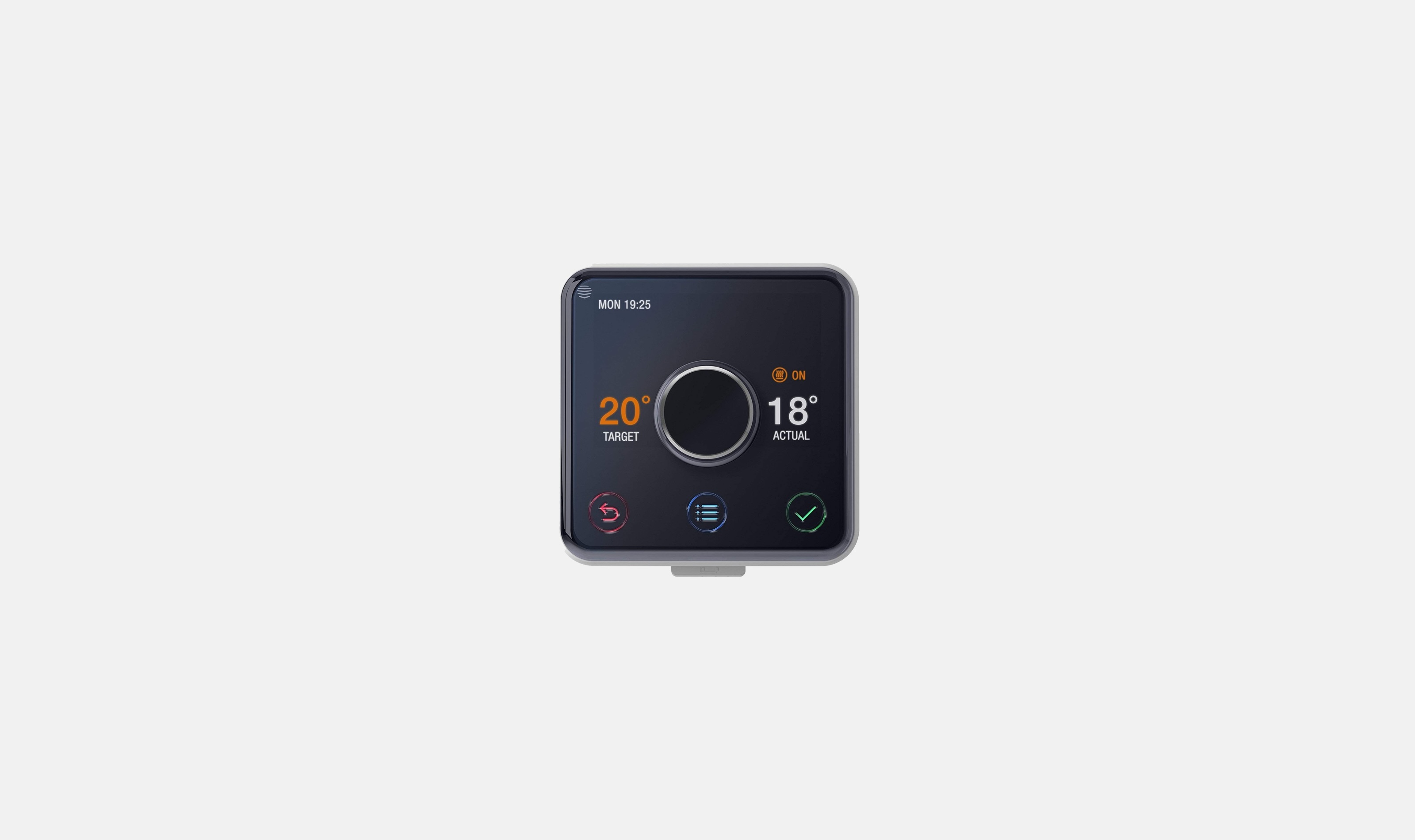
Back in 2015, Hive was one of the first smart home brands to make a real dent in the UK market. Founded as a joint venture between British Gas and various technology partners, it began with a single flagship product: a smart thermostat that let users control their heating remotely from a mobile app. It was a genuinely new idea for most people, and that sense of novelty shaped everything about how the brand had to communicate. By the time I joined the project in 2017, Hive had grown considerably in ambition and complexity. The product line was expanding, the brand identity was being overhauled, and the business was preparing to launch a subscription service model that would fundamentally change how customers related to the company.
Impacts and outcomes
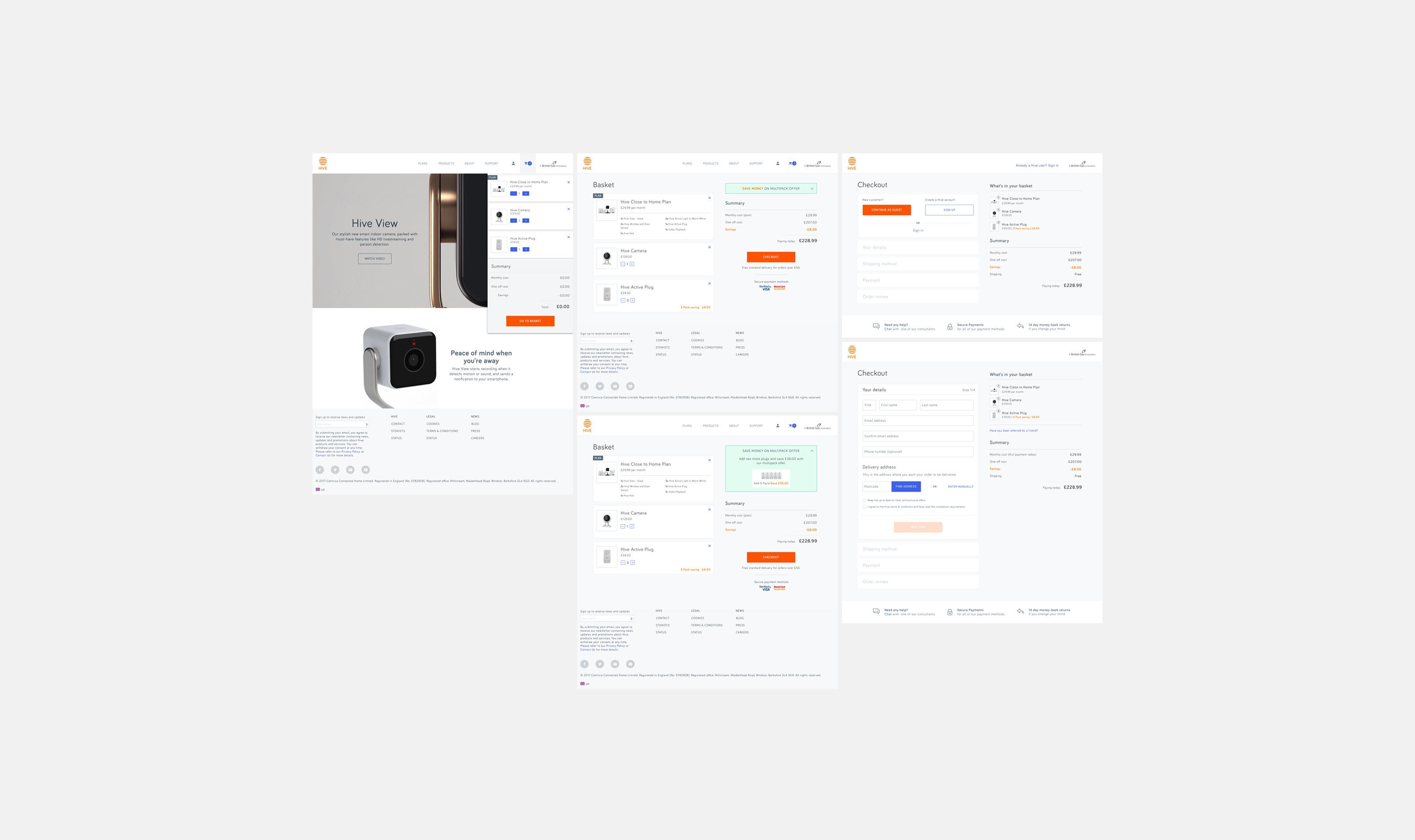
- Redesigned e-commerce journeys and integrated tutorial videos into product pages, improving subscription conversion and reducing setup and troubleshooting support contacts by 28%. Delivered a shared component library and design system adopted by web and app teams, reducing duplication and establishing a scalable foundation for Hive’s digital products.
↑
Subscription conversion post-launch
-28%
Support contacts after tutorial videos
10yr
Core journey still in use today
1
Unified design system for web & app
Problem
Hive was one of the first smart home brands to make a real dent in the UK. By the time I joined in 2017, the range was growing, the brand was being overhauled and a subscription model was about to change how customers related to the company. The e-commerce site had to sell hardware, a new subscription and the idea of a connected home, all in one journey. New plans had to work for existing customers. The new visual language had to hold across web, app, packaging and marketing.
Investigation
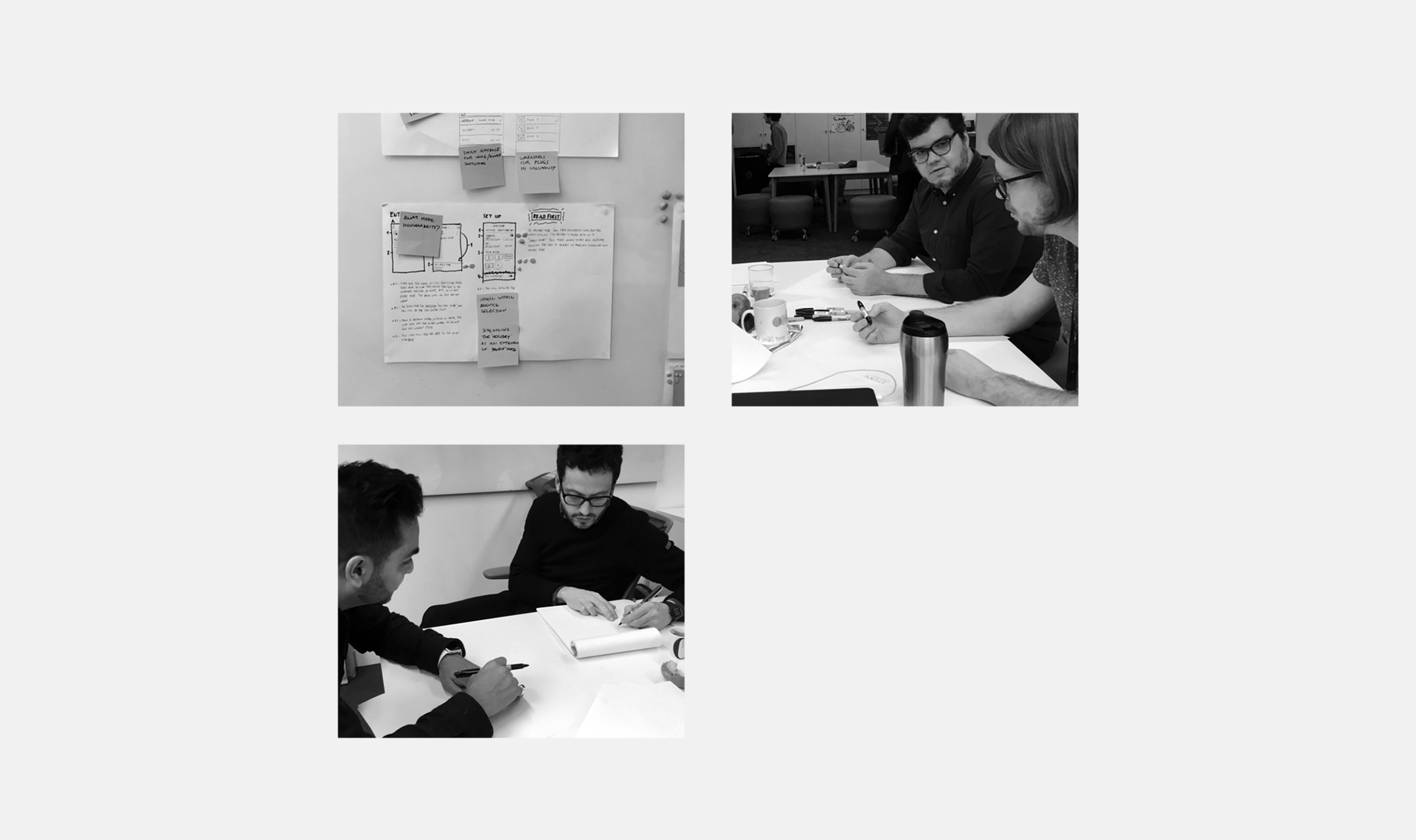
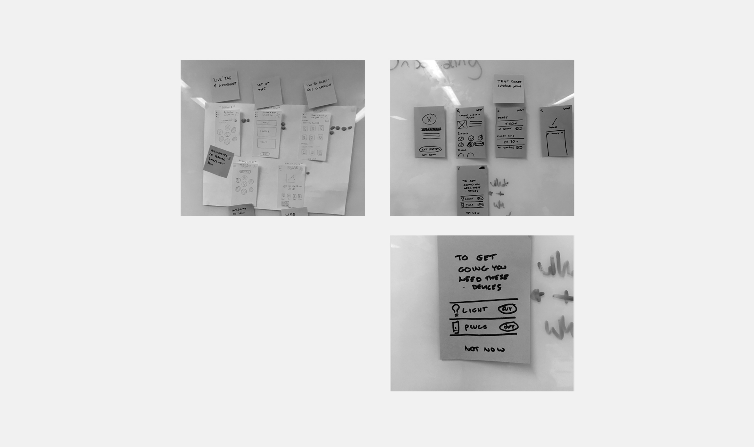
We ran UX labs and discovery workshops in the first weeks, alongside a senior designer, a UX researcher, a copywriter and the app design team. We did card sorting, competitor audits and stakeholder interviews before drawing a single wireframe. Then we tested with users.
Insight
We started with UX labs and discovery workshops to understand how users were interacting with the existing site and where they were getting stuck. The subscription model was the biggest problem. Users could not work out what they were buying or how it would affect their existing setup. That told us the information architecture and the purchase journey had to be rebuilt together, not patched. We ran user testing throughout to make sure the solutions we were building actually resolved the confusion rather than just moving it elsewhere.
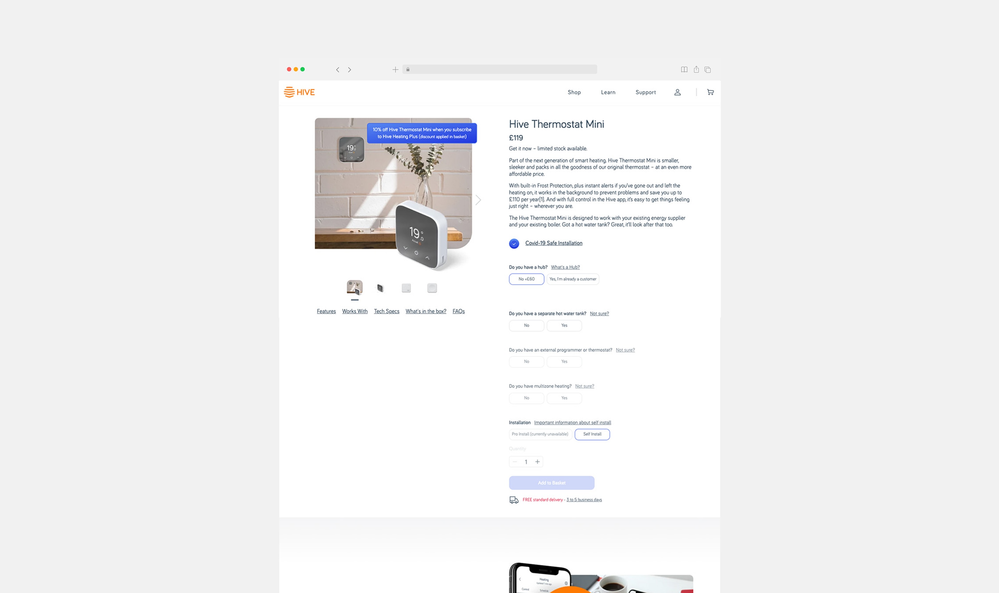
The rebrand added a layer of complexity to every decision. Colours, typography, and component styles were all changing at the same time as the structure. I worked directly with the branding team to make sure the digital interpretation was consistent and practical. We also identified early that product education needed to be built into the site itself rather than pointing users to a separate support channel. I oversaw the production of a set of tutorial and troubleshooting videos tied to specific products, which became a permanent part of the product page template.
Solution
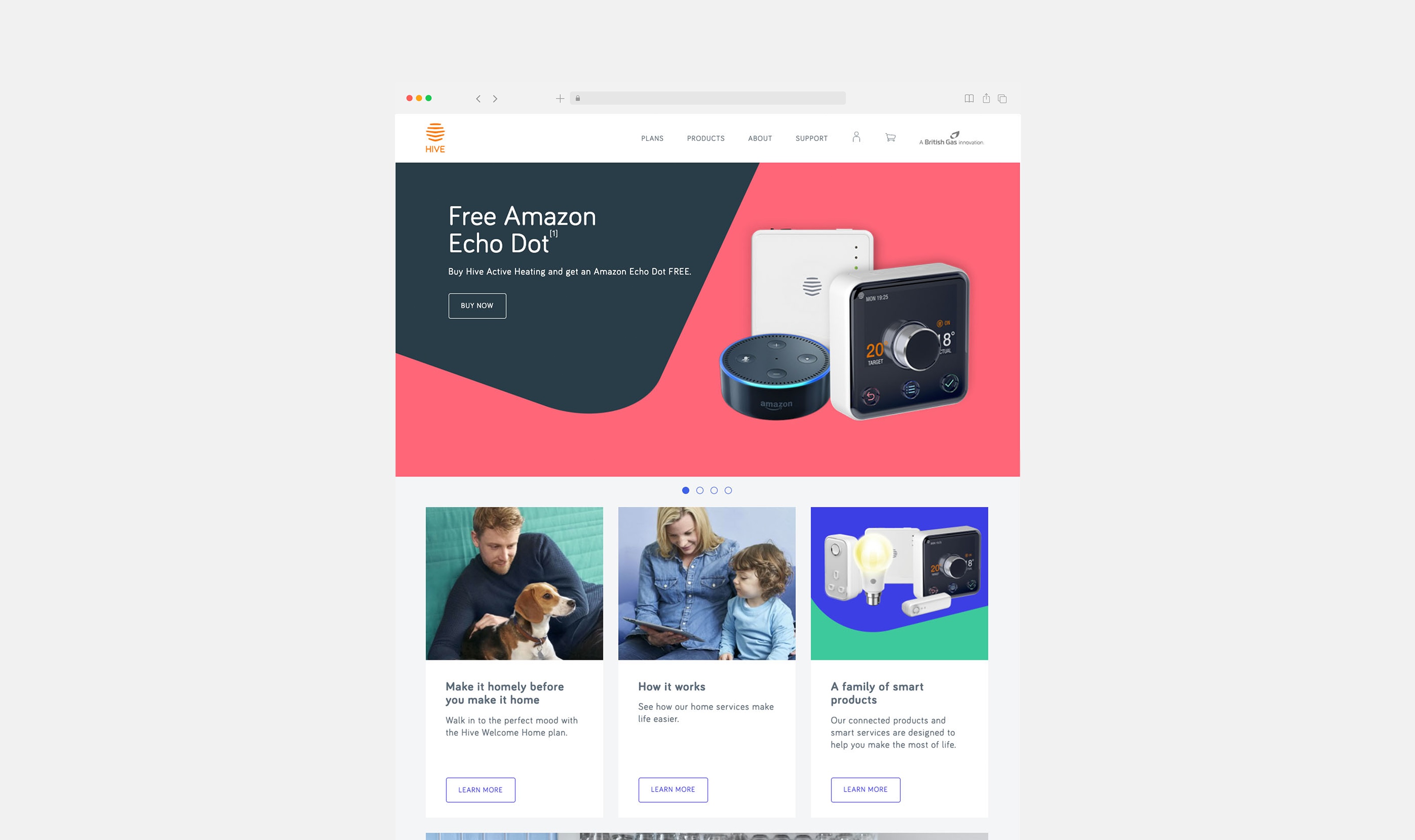
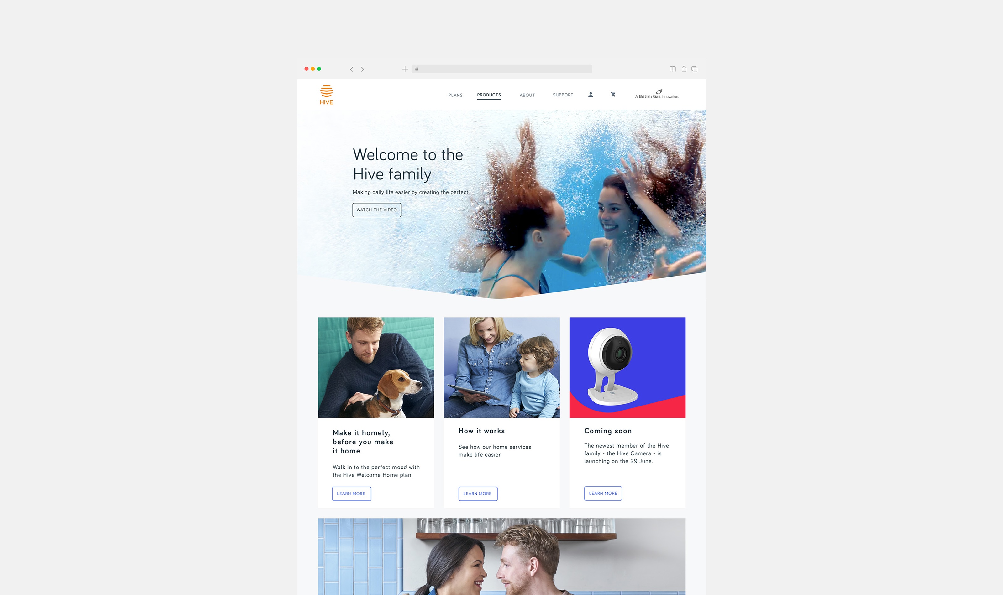
The new Hive site launched with a rebuilt information architecture, a clear e-commerce journey for both new and existing customers, and the full new visual identity applied consistently across every page. The subscription service was explained in plain language at each relevant point in the journey, with a purchase flow that accounted for what a user already owned. Tutorial and troubleshooting videos sat directly on product pages. The design system built during the project became the base for the Hive website going forward. More than ten years later, the core user journey and design foundation remain in place.